Bar graphs present the numbers of an item in different categories. The categories are shown on one axis, and the number of items is shown on the other axis. Bar graphs are used for comparison.
Histograms similarly use bars to compare data, but the independent variable is a continuous variable that has been “binned” or divided into categories. For example, the time of day can be broken down from 8:00 a.m. to 12:00 p.m., 12:00 p.m. to 4:00 p.m., and so on. Usually (but not always), a gap is included between the bars of a bar graph but not a histogram.
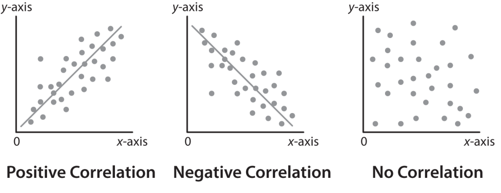
Scatter Plots and Correlation
Scatter plots show the relationship between two sets of data by plotting the data as ordered pairs (x, y). One variable is plotted along the horizontal axis, and the second variable is plotted along the vertical axis.
The data in a scatter plot may show a linear relationship between the data sets.
There is a positive correlation (a positive slope) if an increase in one variable corresponds to an increase in the other variable.
A negative correlation (a negative slope) occurs when an increase in one variable corresponds to a decrease in the other.
If the scatter plot shows no discernible pattern, then there is no correlation (a zero, mixed, or indiscernible slope).
Correlation is a mathematical term that describes two variables that are statistically related (meaning one variable can be used to predict the other). The closer the points are clustered together in a scatter plot, the stronger the correlation.
Causation means that one variable directly influences another through a known mechanism. Correlation is not the same as causation: knowing two variables are statistically related does not mean one is directly influencing the other.
Line Graphs
Line graphs are used to display a relationship between two continuous variables, such as change over time. Line graphs are constructed by graphing each point and connecting each point to the next point by a line.
In a line graph, each x-value corresponds to exactly one y-value. A scatter plot may have multiple y-values for one x-value.
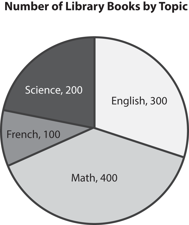
Pie Charts
Pie charts show parts of a whole and are often used with percentages. Together, all the slices of the pie add up to the total number of items, or 100%.
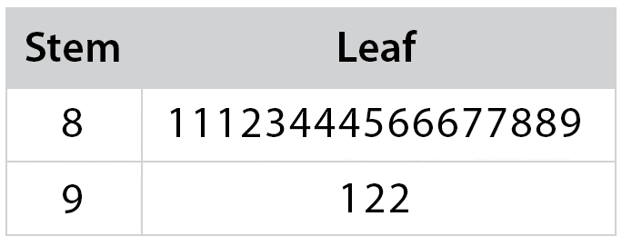
Stem-and-Lead Plots
Stem-and-leaf plots are ways of organizing large amounts of data by grouping into rows. All data points are broken into two parts: a stem and a leaf. For instance, the number 81 can be broken down into a stem of 8 and a leaf of 1. All data in the 80s (i.e., that have the same stem) would appear in the same row (this group of data is called a class).
The advantage of this display is that it shows the general density and shape of the data in a compact display, yet all original data points are preserved and available. It is also easy to find medians and quartiles from this display.